Over 70% of website traffic in Luxembourg now comes from phones. If your site does not respond properly to small screens, you are losing customers the moment they land — and Google is quietly downranking you for it.
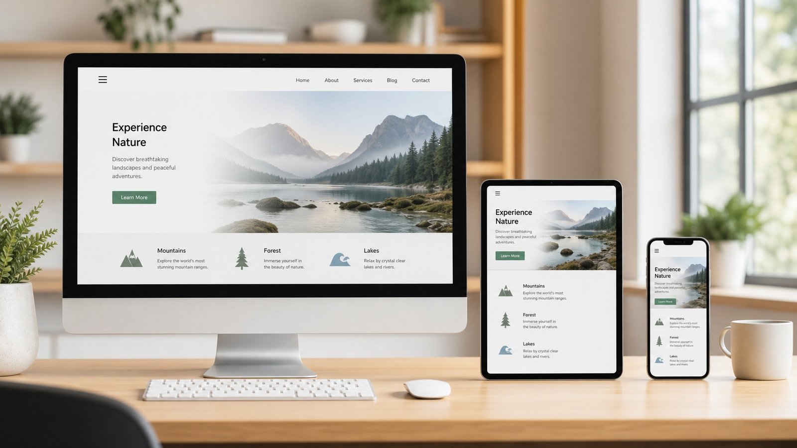
What does "responsive" actually mean?
A responsive website is one whose layout adapts automatically to the size of the screen it is displayed on. The same site shrinks navigation into a hamburger menu on mobile, rearranges columns into a single stack, scales fonts, and resizes images — all without losing readability or usability.
Why it matters for Luxembourg businesses
Luxembourg has one of the highest mobile penetration rates in Europe. Customers searching "restaurant near me" or "plumber Luxembourg" are almost always on a phone. A non-responsive site looks broken, loads slowly, and gives the impression of an outdated business. Google also uses mobile-first indexing — meaning your mobile version is what gets ranked.
How to tell if your site is responsive
Open your website on your phone. If you have to zoom in to read text or tap navigation links, your site is not properly responsive. Use Google's Mobile-Friendly Test (free) for a definitive answer.
The takeaway
If your site is not responsive in 2026, it is costing you customers every single day. At DoitD we build mobile-first websites from the ground up — never desktop sites with mobile bolted on.